Rocket Homes
A home search platform. It guides buyers who are not yet sure they are buyers, and held a 4.9★ rating through the merger.
- Problem
- Rocket HQ and Rocket Homes were merging into one app, one website and one team, and the score behind free credit monitoring was due to move from Vantage to FICO, which would shift a number members had watched for a year.
- Role
- Senior Product Designer. On the merger, helped migrate both apps and combine their designs into one app structure. On the credit switch, the whole communication arc (pre-launch email, launch announcement, in-app explainer, follow-up banner) and a rebuilt FICO gauge system, designed in full before the switch was paused. And the home affordability calculator, built into search, the map and every listing.
- Result
- Two apps, two websites and two teams became one, design and development together, and the app held a 4.9+ star rating through the transition.
- Role
- Senior Product Designer
- Year
- 2020–22
- Work
- Search · affordability · credit · web + app
One app instead of two
Rocket HQ and Rocket Homes were two apps, two websites and two teams, and they became one of each. I helped migrate both apps and combine their designs into a single app structure, while design and development merged into one team. The app kept a 4.9+ star rating through the transition.
Affordability, everywhere
One set of numbers, carried from the calculator into search, the map and every listing.
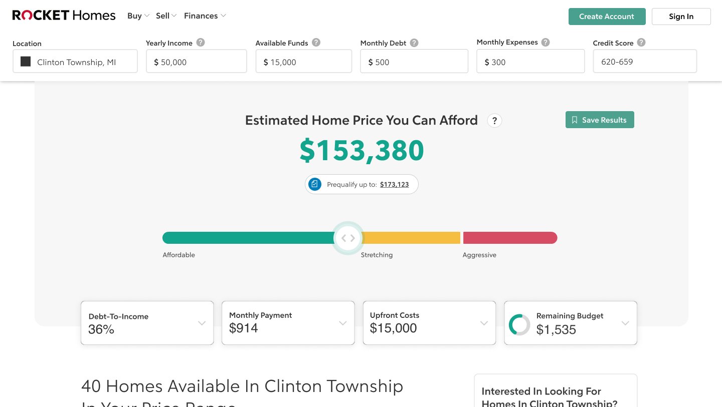
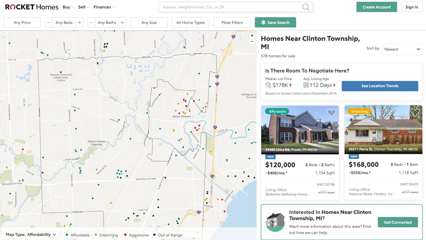
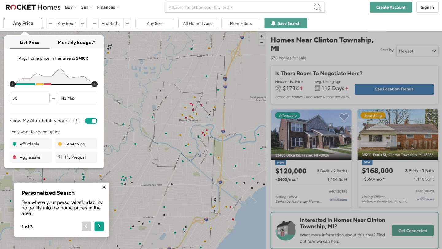
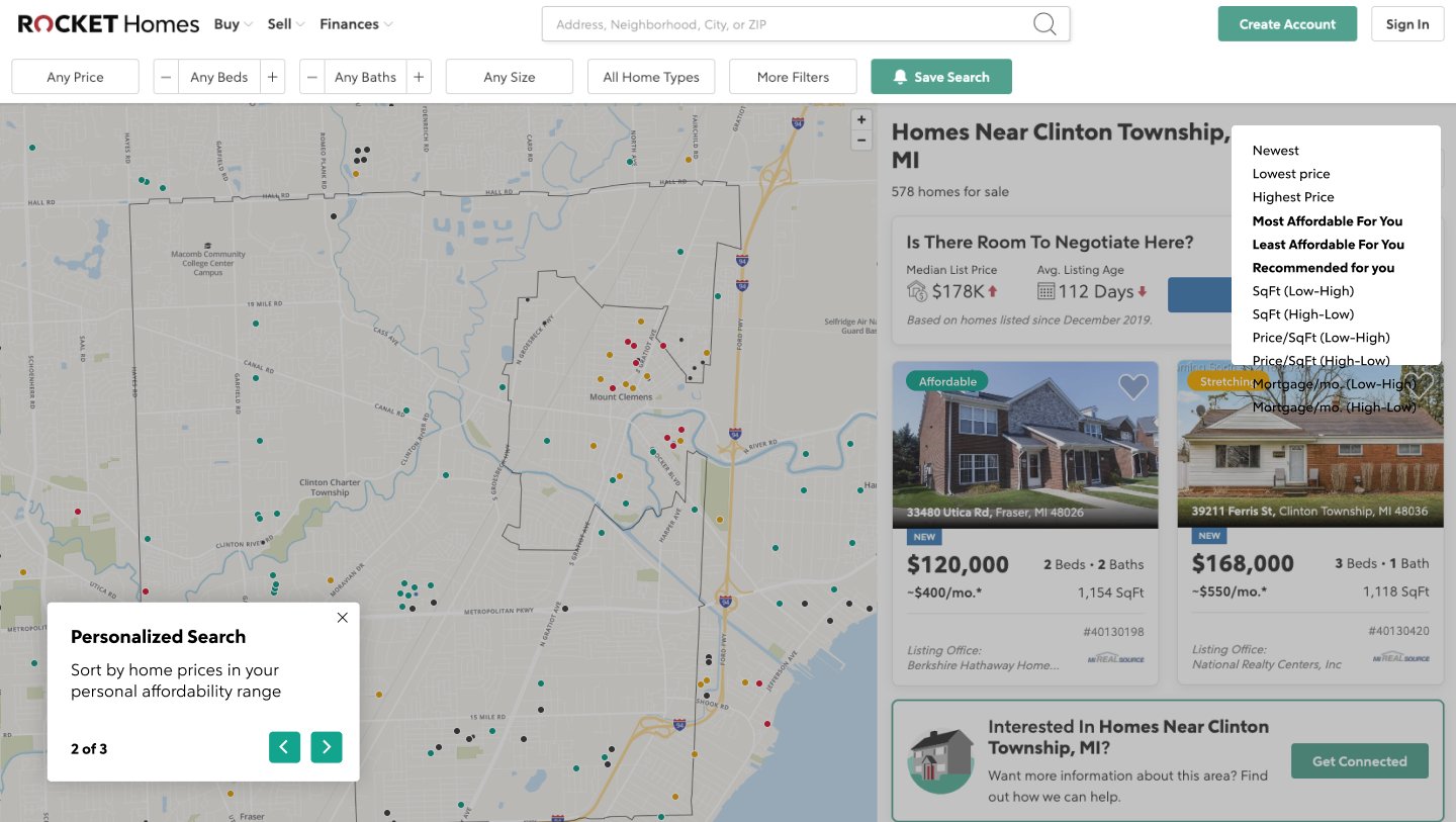
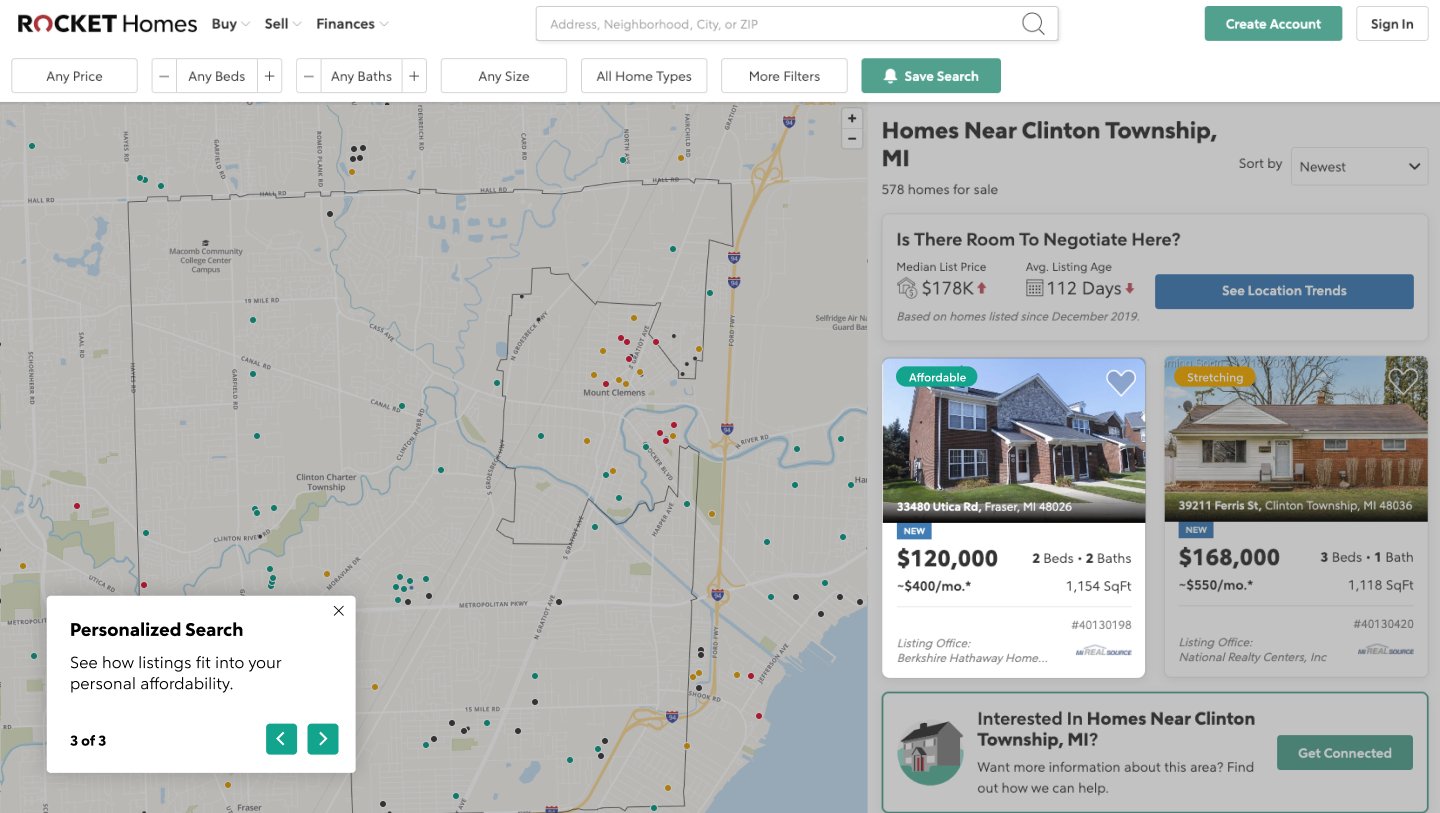
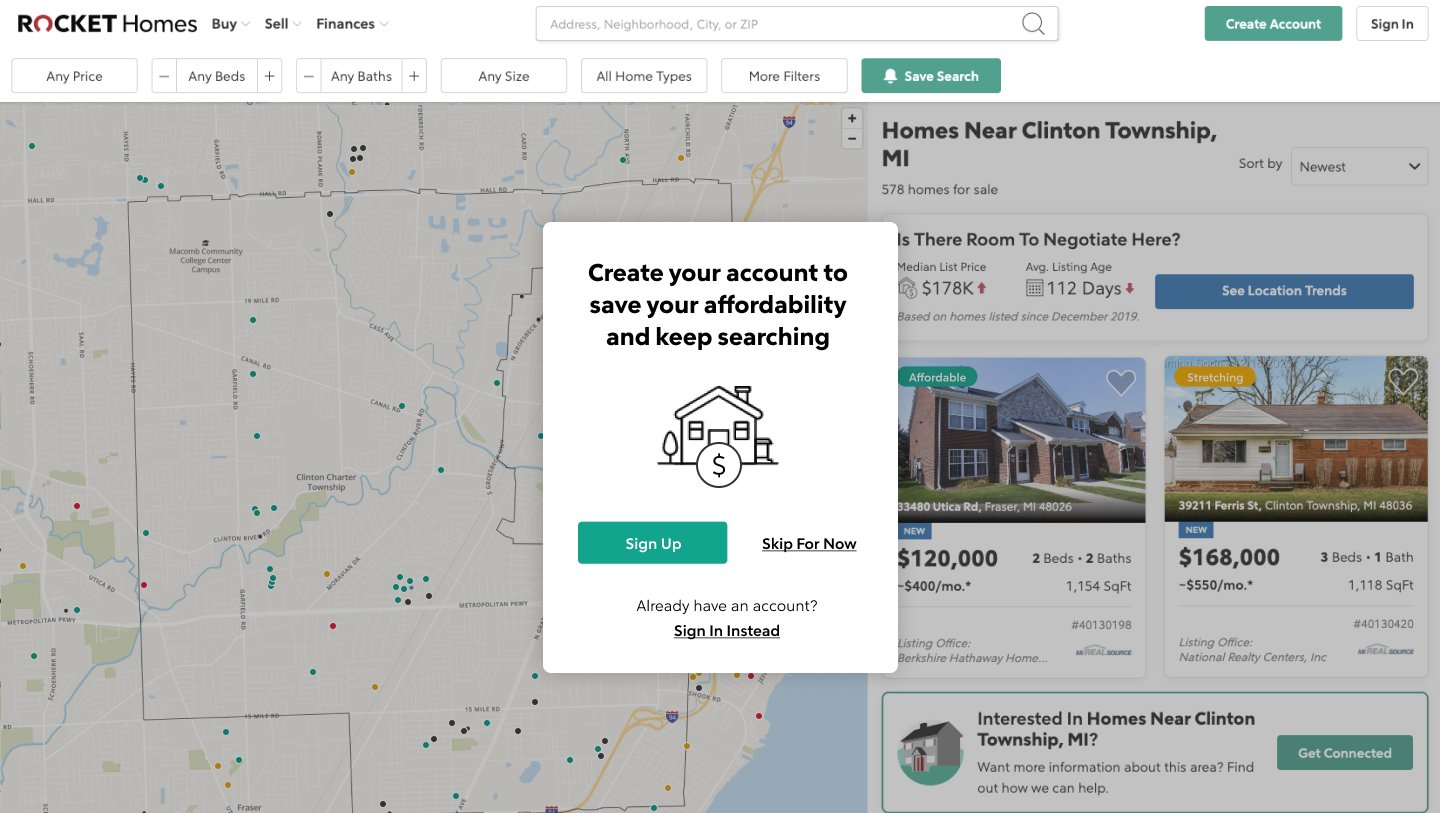
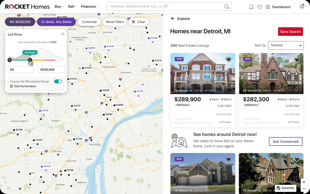
I designed the home affordability calculator to work across the whole product, not as a page of its own. Your numbers set an affordability scale, and that scale shows up wherever price does. On desktop, the calculator gives you a number, $153,380 in this example, on a scale from affordable to stretching to aggressive. The map colours each listing by how well it fits your range, a short three-step tour introduces the personalised search the first time you see it, and a prompt invites you to create an account and save your range.
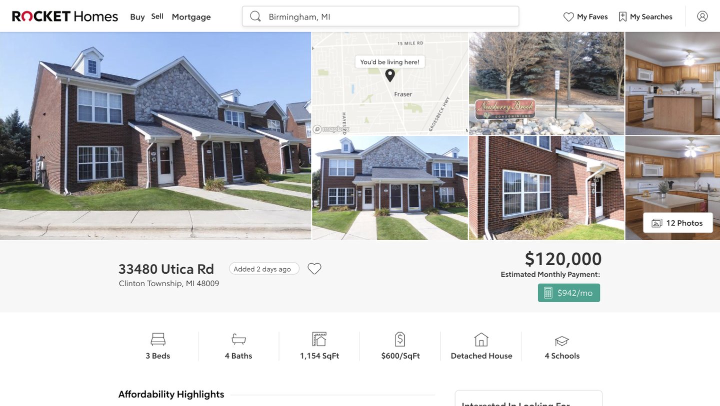
On every listing
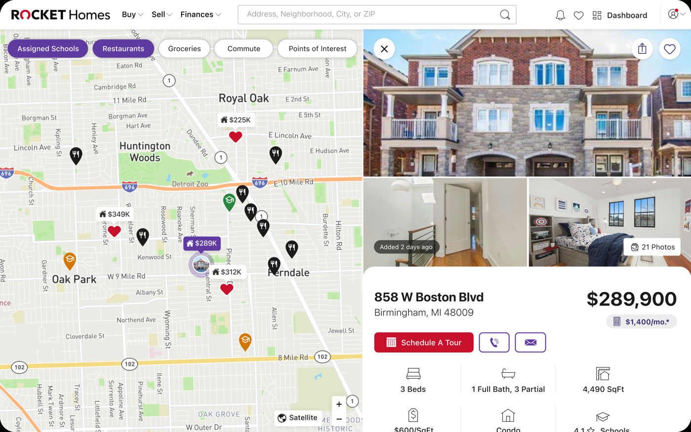
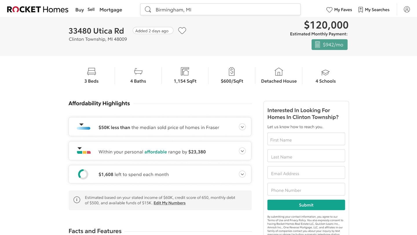
Each listing shows the estimated monthly payment beside the price, plus affordability highlights like “$50K less than the median”, “within your range by $23,380” and “$1,608 left to spend each month”. In search, your range sits over the price filter, coloured from affordable to out of reach. So you can see how a home fits your budget while you're looking at it, instead of working it out somewhere else.
The calculator on mobile
Four short steps to an estimate.
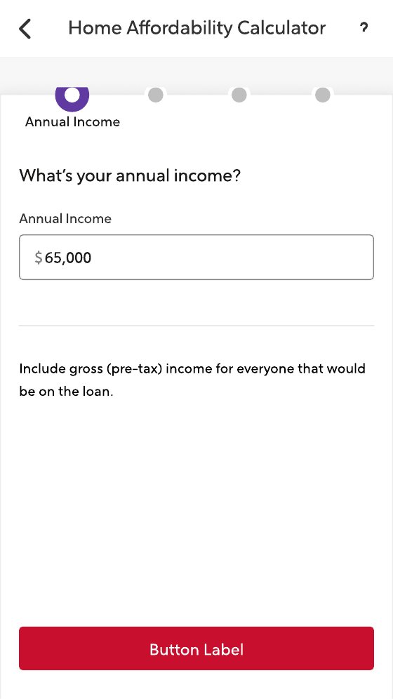
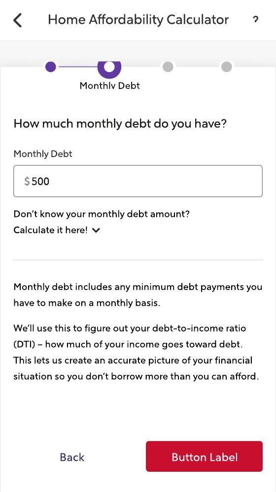
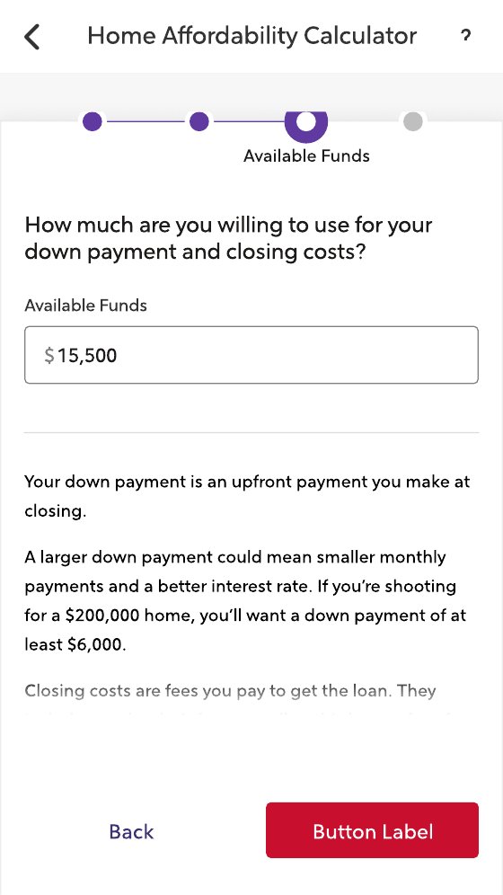
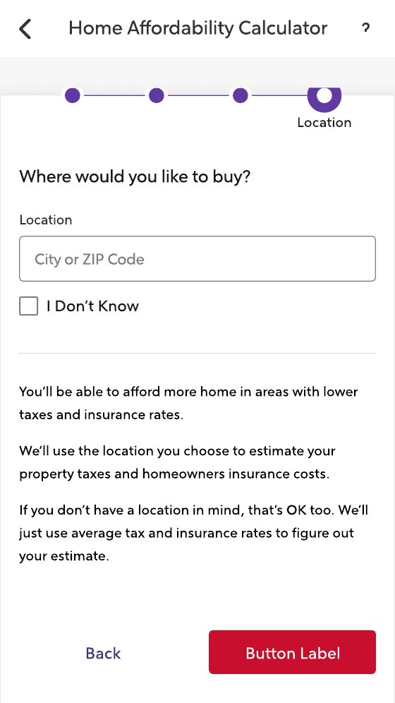
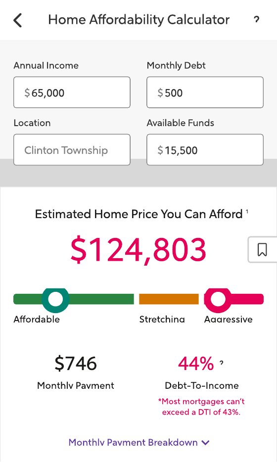
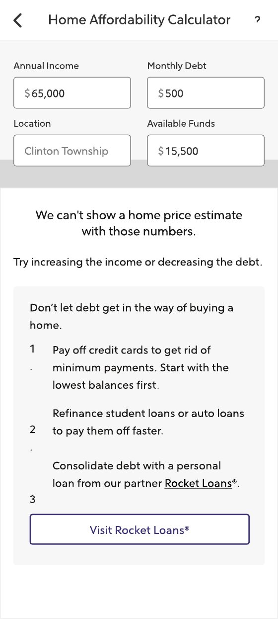
On mobile, the calculator is a short guided flow: income, monthly debt, down payment and closing costs, then where you want to buy. The result comes with a warning when your debt-to-income ratio is high, and when there isn't an estimate yet, the app says so and suggests what would help, like paying down debt.
Home screen widgets
Rocket Homes on the iOS home and lock screens.
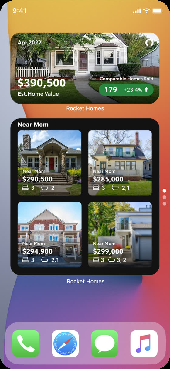
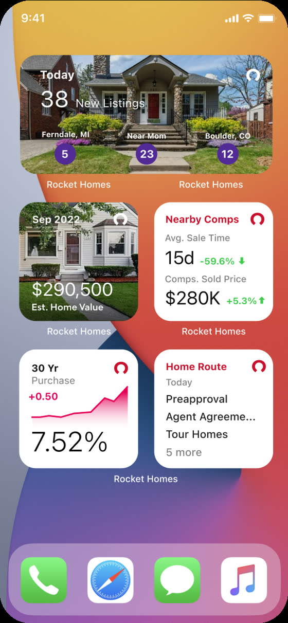
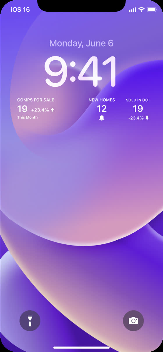
The app also got a set of iOS widgets, so the market comes to you without opening the app: your home's estimated value with comparable homes sold, homes for sale near a place you saved, new listings in the areas you follow, nearby comps with average sale time and sold price, today's 30-year rate, and your Home Route checklist (preapproval, agent agreement, touring homes). Smaller versions sit on the lock screen.
A change to the credit score
Rocket Homes gave members free credit monitoring, and in 2020 the plan was to switch the score behind it from Vantage to FICO. On paper that's a back-end change. For members, it meant a number they'd watched for a year would move for no reason they caused. People don't read a credit score calmly: if it moves without explanation, they'll assume the product broke, or worse, that it was wrong before. So the change couldn't just go out in the release notes.
New score messaging
The emails and screens, in the order a member would have seen them.
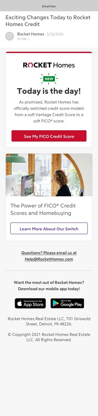
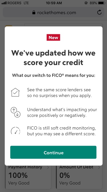
I designed the whole sequence, not just one screen: an email six weeks before, explaining that the new score is the one lenders actually use; a launch-day announcement; an in-app explainer the first time a member opened the dashboard after the switch; and a banner for people who dismissed everything and noticed later. The explainer says up front that your score may be different. Burying that under the benefits would backfire, because anyone who spots a drop after hearing only good news will feel misled.

The credit dashboard
Where the new score lives, and the gauges behind it.
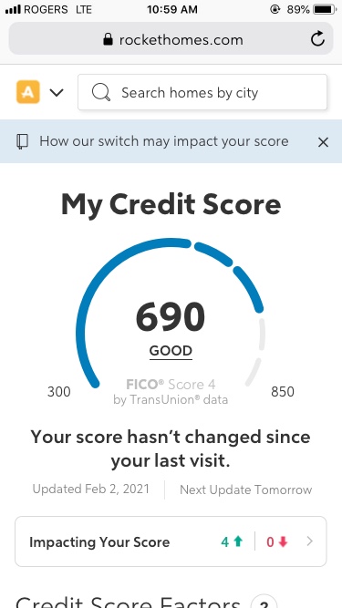
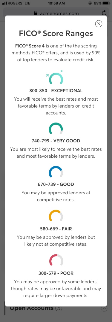
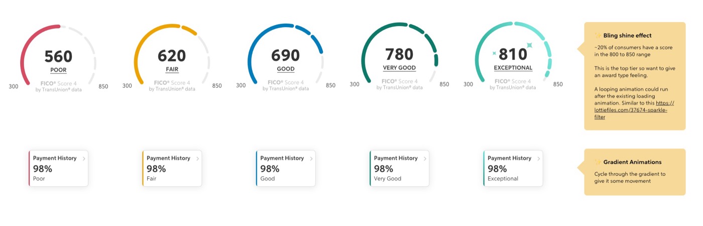
FICO's score bands are different from Vantage's, so the gauge had to be rebuilt: five states from Poor to Exceptional, each with its own colour, carried through to every credit-factor card below it. Exceptional got a shine, since only about 20% of people ever see it. A ranges sheet explains each band in one plain sentence about what it means with a lender, because a number between 300 and 850 doesn't mean much on its own.

The credit factors
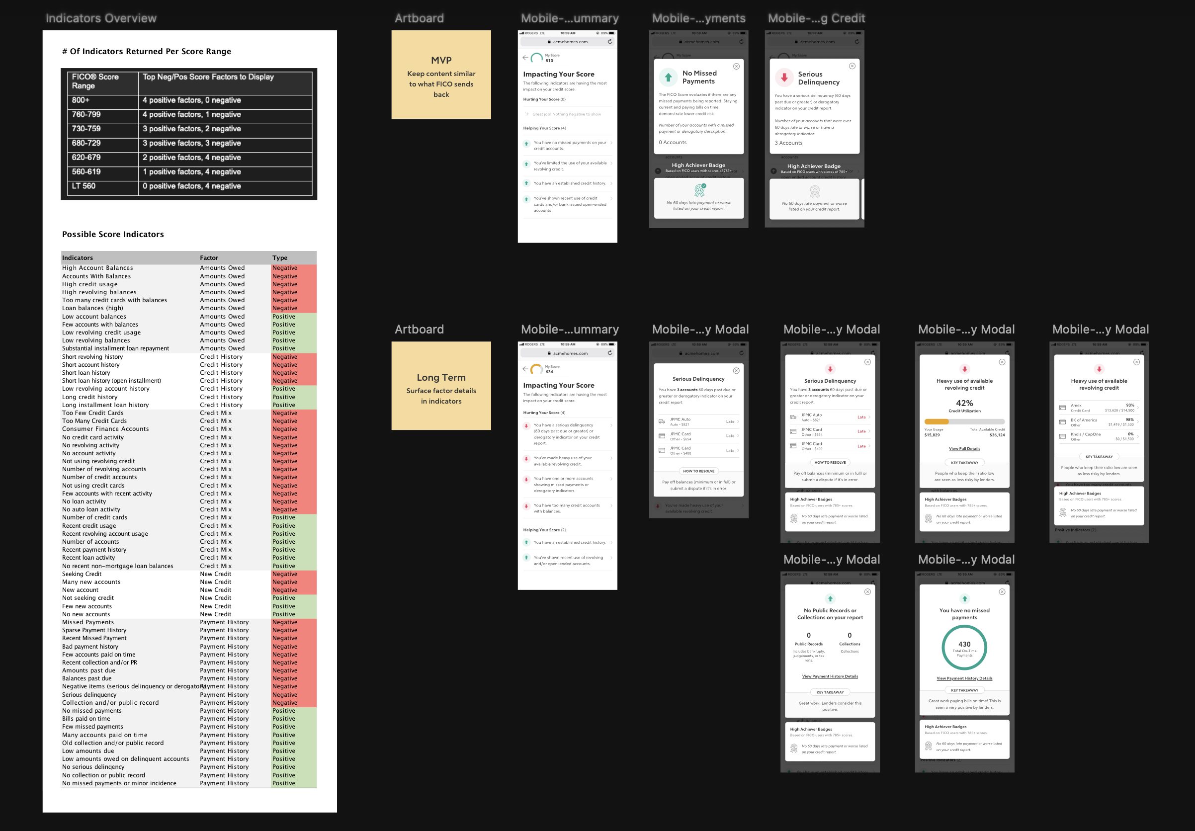
FICO returns up to four positive and four negative factors, depending on the score range. I mapped every possible indicator to its factor and whether it helps or hurts, then designed two versions: an MVP that sticks to what FICO returns, and a longer-term version that gives each factor its own detail card.
Where it ended
The switch was paused before launch, with the emails, gauges and factor cards fully designed, and I left Rocket Homes before it was picked back up, so I don't know what shipped in the end. The approach still holds: a score that changes without warning brings a wave of support tickets, and the plan here was to announce it instead, with six weeks' notice, an explainer the first time members saw the new number, and a banner for anyone who missed the rest.