
No.009 · UX + visual design · 2019
ROCKET LANDING
The pages before you sign in. Four in five new accounts were first-time buyers who had no idea what they were looking at.
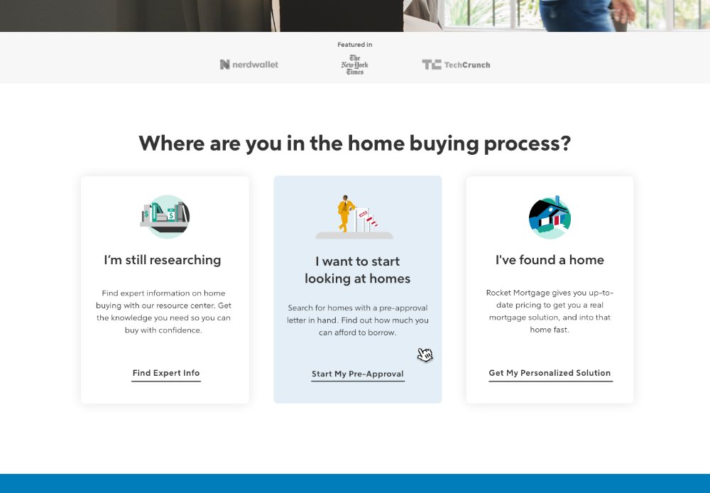
- PROBLEM
- 80% of new Rocket accounts were first-time buyers, arriving without the information they needed to act on the largest financial decision of their lives.
- ROLE
- Redesigned the pages before sign-in with product managers, content strategists and UX research, built around what we knew about the Information Seeker persona, in the new brand.
- RESULT
- Visit-to-application-start on the purchase pages rose 16% (34.2% to 39.8%) at the largest mortgage lender in the US, and 7.5% on refinance (20% to 21.5%).
- Client
- Quicken Loans
- Year
- 2019
- Role
- UX + visual design
- Software
- Sketch · InVision · Principle · Photoshop
THE PROBLEM
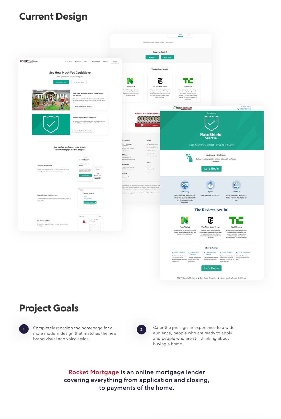
Research showed 80% of new Rocket accounts were first-time home buyers. They arrived without the information they needed, and left with unmet expectations and not enough clarity to make what is, for most people, the biggest financial decision of their life.
THE SOLUTION
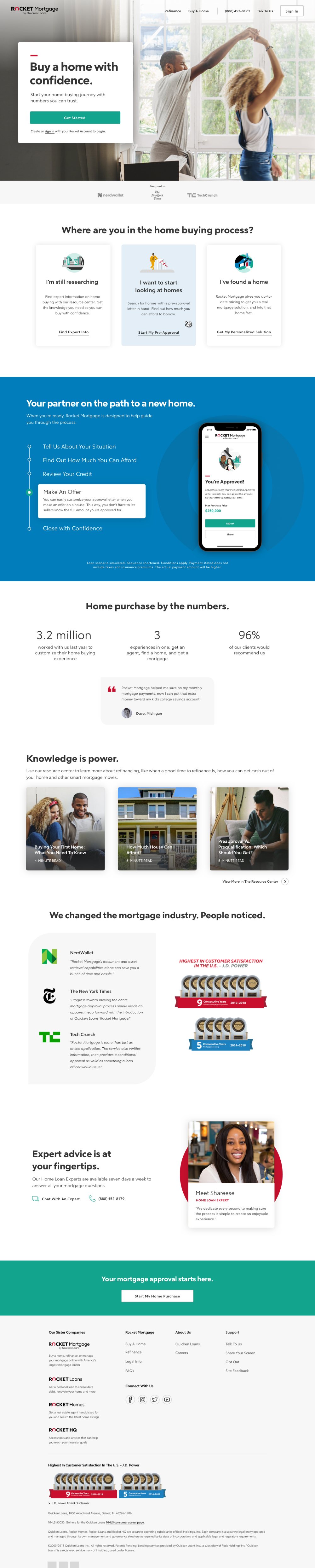
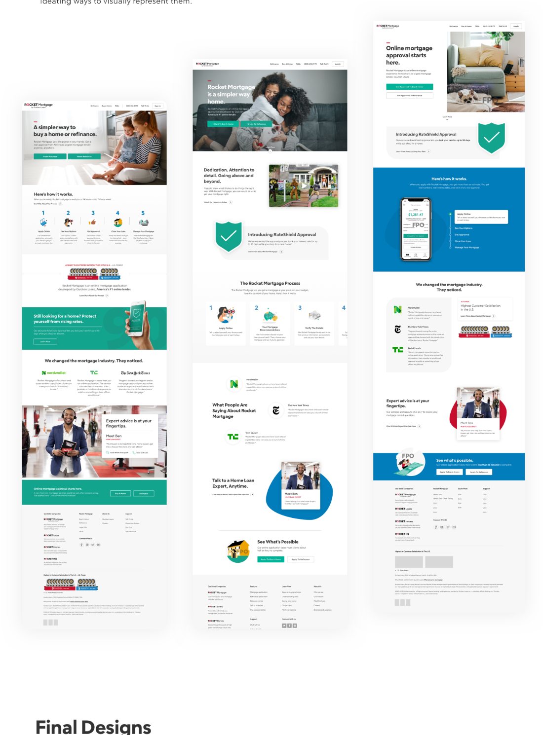
We rebuilt the pages before sign-in around the questions first-time buyers actually arrive with, in the new brand, and served people ready to apply and people still researching on the same pages instead of splitting them.
HOW WE GOT THERE
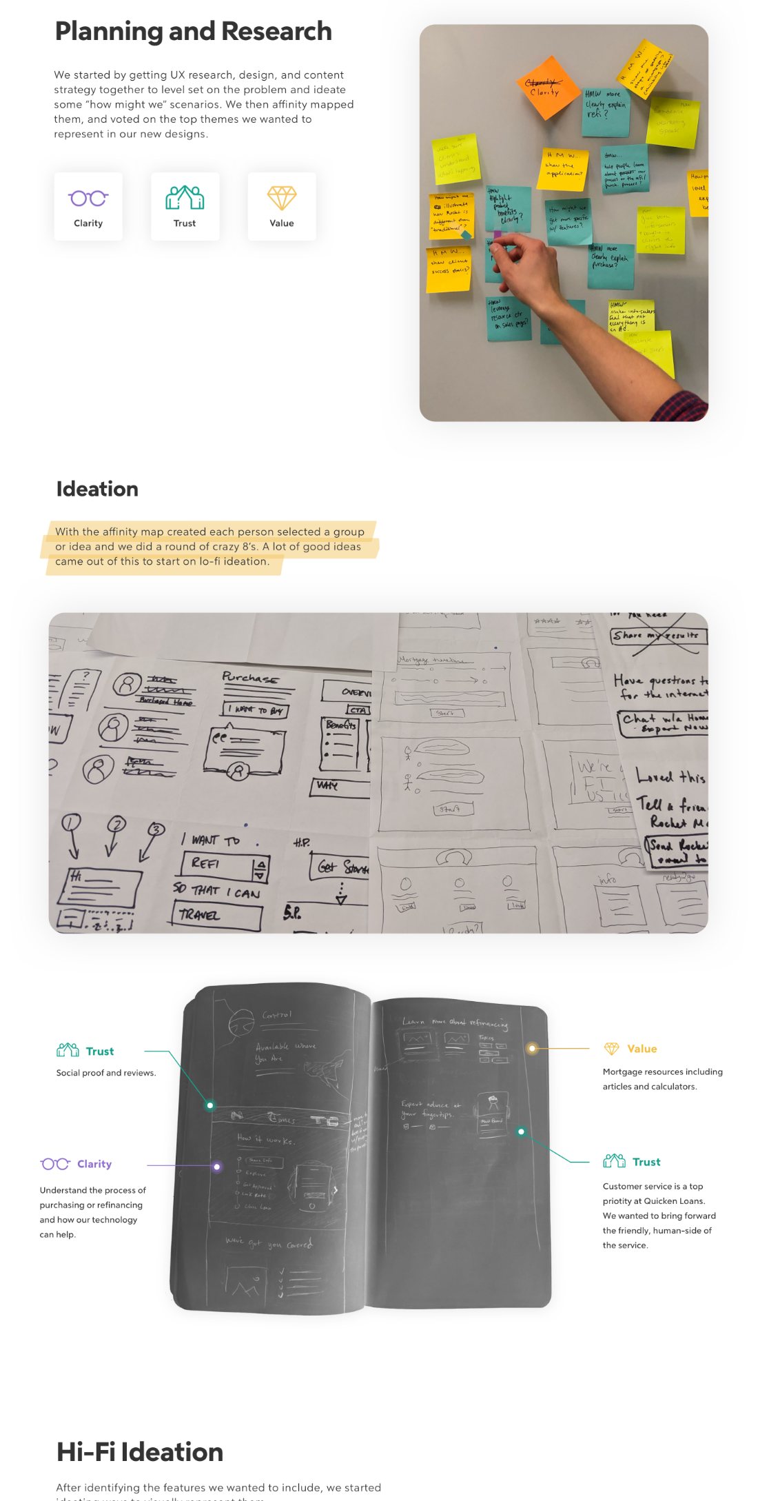
Product managers, UX research, design and content strategy got in one room first, to agree on the problem before anyone drew anything. We ran how-might-we exercises, affinity mapped them, and voted on the themes to carry forward: clarity, trust and value. We then designed three different versions from those themes, so the final choice was made against real alternatives.
RESULTS
- Purchase sales page: visit-to-app-start 34.2% → 39.8%, a 16% lift
- Refinance sales page: 20% → 21.5%, a 7.5% lift
- Homepage redesign: +19% visit-to-app-start against the first rebranded homepage
- After the rebrand, visits were 1.2× more likely to become application starts, and starts 1.3× more likely to reach a mortgage solution
- Clients who saw results in the Info Seeker path converted to credit at 52%, against 48% for those who did not
WHY IT WORKED
The lift suggests the problem was understanding, not looks: people weren't failing to apply because of how the page looked, but because nothing had explained what they were deciding.
ALSO: ASSET UPLOAD
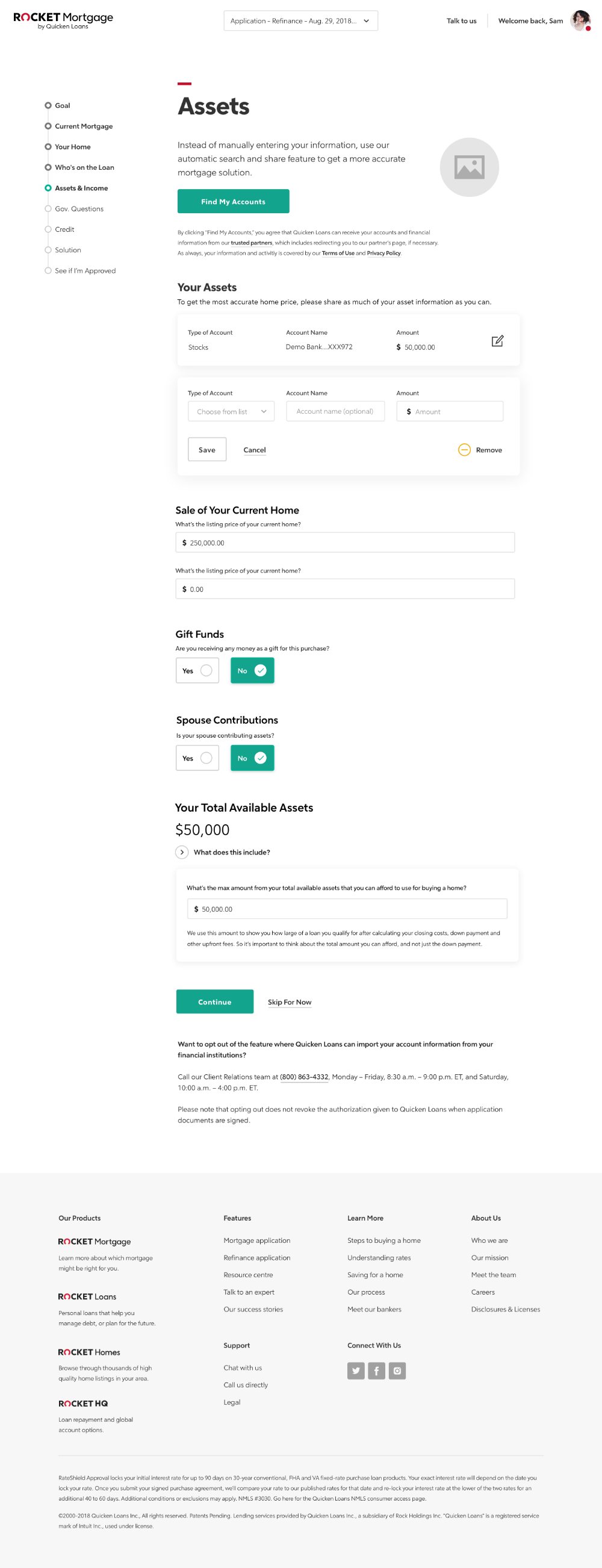
Separately from the redesign, I designed asset upload in the application, as part of a multi-team effort with bankers coaching clients through adding assets. Purchase allocations with an approval letter went from 19% to 26%, a 37% lift, and clients clicking to get approved after seeing a solution went from 48% to 70%, a 46% lift.
ALSO: APP STORE REVIEWS
I helped start asking for App Store reviews right after good moments in the app. The iOS rating went from 3.2 to 4.8 stars, and visit-to-download conversion from 48% to 72%: 50% more downloads from the same traffic.