
No.008 · Lead UX designer · 2018–19
ROCKET REBRAND
Four sibling brands rebranded at once, working alongside the agencies Lippincott and Metalabs.
- PROBLEM
- Four sibling brands needed one new identity at once, on top of years of small inconsistencies left by separate development teams.
- ROLE
- Lead Quicken Loans UX designer alongside Lippincott and Metalabs: built the rebranded Sketch component library and applied it across responsive web, iOS and Android.
- RESULT
- In testing, nobody struggled to find their next step in the new client-driven dashboard, and several participants asked for an account so they could keep it.
- Client
- Quicken Loans
- Year
- 2018–19
- Role
- Lead UX Designer
- Software
- Sketch · InVision · Principle
THE PROJECT
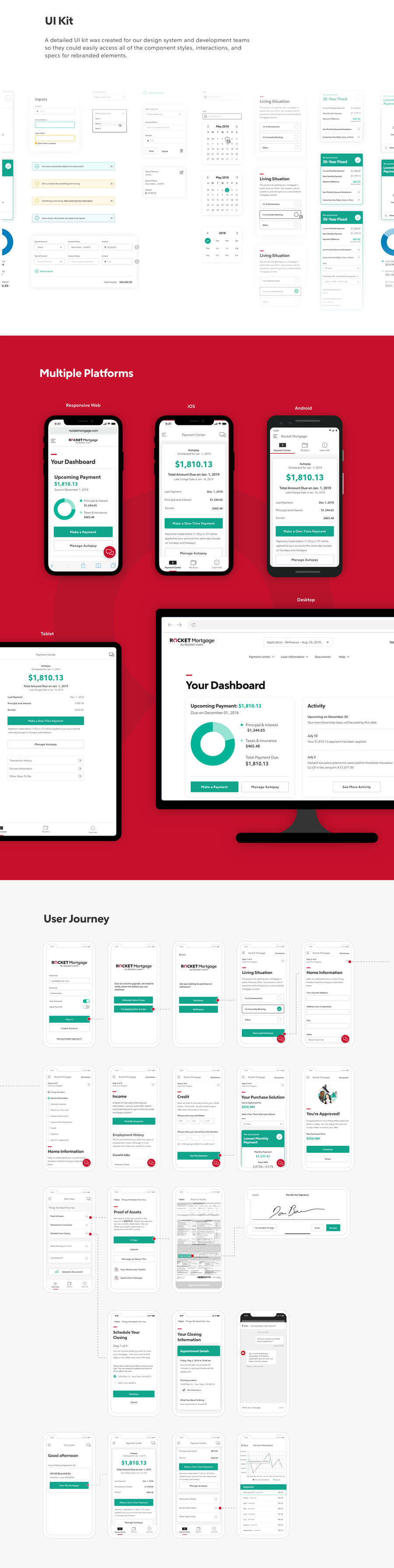
A redesign of Rocket Mortgage and its sister companies, Rocket Homes, Rocket Loans and Rocket HQ, with the agencies Lippincott and Metalabs. As the lead Quicken Loans UX designer, I combined our team's work with theirs to unify the visual design, the brand and the overall experience.
GOALS
- Bring all four Rocket companies under the new identity
- Build brand trust with new and existing clients
- Make it easy to move between Mortgage, Homes, Loans and HQ
MY ROLE
I explored design directions, built the rebranded Sketch component library, worked with the Spark design system team to implement it, applied the new style across responsive web, iOS and Android, and worked with several development teams to ship it.
THE SKETCH LIBRARY
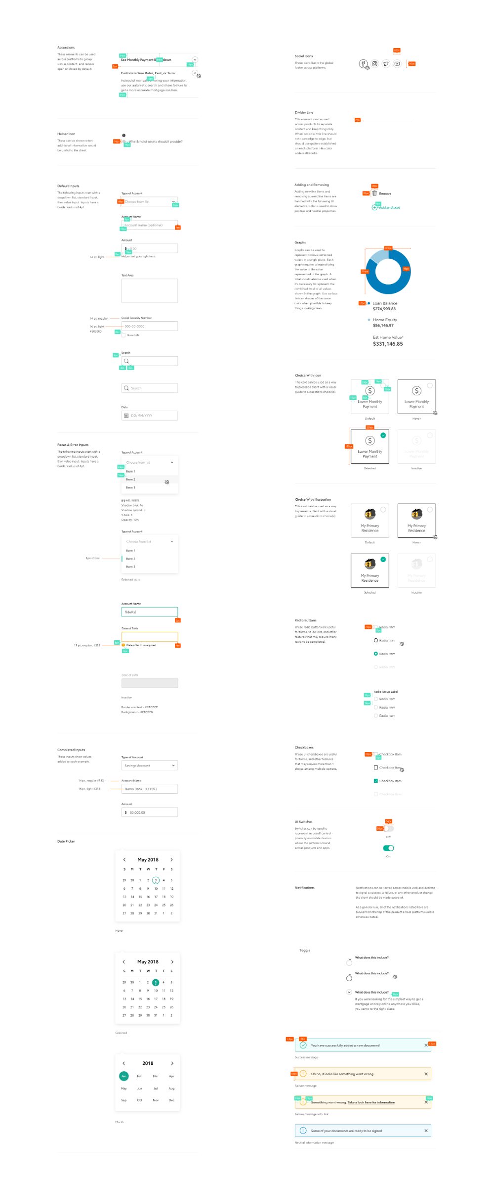
We started by testing how the new brand looked on the components in Spark, our internal design system. I built a Sketch library the whole team could pull from, so a fix to a component reached everyone's files instead of being redrawn six times. Lippincott's first direction was bold black and red, with sharp corners on buttons and cards.
CLEANING UP NAVIGATION
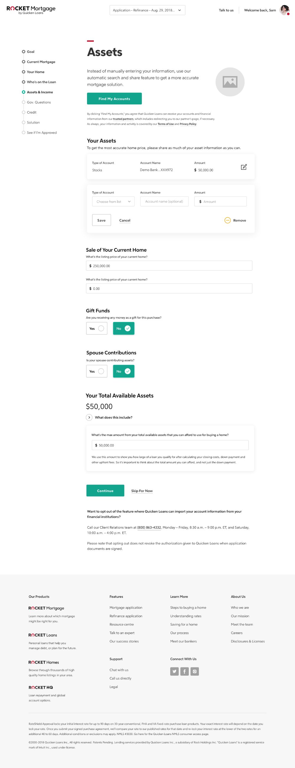
Years of features owned by different teams had left small inconsistencies everywhere: font weights and sizes, interaction patterns, naming. Before we could unify anything, we had to collect every variant and sort through them. In a rebrand this size, most of the work is the inventory, not the styling.
A DASHBOARD THAT STARTS WITH YOU
A UX architect and I designed a different starting point: ask where someone is in the process and how confident they feel, then give them a dashboard of resources so they can go at their own pace. Asking for an email to save it meant they could come back, and it generated leads without asking for an application up front.
WHAT TESTING SHOWED
- Participants liked how much of the home-buying process it laid out, and said it would help their confidence
- Nobody struggled to work out their next step
- Several asked to make an account so the dashboard would still be there later
LOOKING BACK
Keeping everyone on the latest Sketch library was harder than it should have been. There was nowhere to host it, so I re-sent the file by hand on a schedule. A tool like Abstract would have solved it. Next time I'd sort out the tooling before the work starts, and give it proper time.